Rieles de Esperanza
Rieles de Esperanza is a social activism campaign created by Studio Boqui to raise awareness about the experiences of migrants traveling through Mexico aboard La Bestia.
Team
9 team members (3 designers specialized in UX/UI, 3 specialized in advertising, 2 specialized in illustration, 1 specialized in branding).
Role
Creative Direction · UX/UI & Web Design · Project Coordination · Editorial Design
Duration
5 months

Rieles de Esperanza was a collaborative social-impact project developed by Studio Boqui, a student-led creative team we formed specifically for a university assignment. The project focused on raising awareness around the experiences of migrants traveling through Mexico on La Bestia, particularly within the Guadalajara community.
Although the project originated as an academicassignment, the campaign was developed and executed as a real-world initiative, combining research, communication, digital experiences, physical interventions, and community participation to move the conversation beyond awareness and toward concrete forms of support.
My role combined Creative Direction, Project Coordination, UX/UI & Web Design, and Editorial Design. I helped lead the project from its initial planning stages through execution, coordinating the team, external communication, timelines, and deliverables while also leading the design of the digital experience and several of the campaign's physical communication materials.


The Challenge
Migration through Mexico is a complex issue that can be difficult for communities to understand beyond the statistics.
Within the university community, the project identified a lack of information, stereotypes, and indifference toward the experiences of migrants traveling through Guadalajara. At the same time, organizations supporting migrants already existed, but there was an opportunity to make their work and the ways people could contribute more visible.
The challenge was therefore not simply to create a campaign, but to build a communication system capable of:
Making the issue easier to understand.
Humanizing the experiences behind the topic.
Connecting people with reliable information.
Making opportunities to participate visible.
Connecting digital communication with physical actions.
Guiding the audience from awareness toward participation.
The project ultimately centered on a campaign that combined digital content, a website, physical interventions, social media, and a donation collection supporting migrants.
My Role
Although Rieles de Esperanza was a collaborative project, I had a multidisciplinary role that went beyond visual execution.
I worked as Creative Director / Web | UX & UI, taking responsibility for both the creative direction of the team and several of the project's digital and physical deliverables.
Creative Direction & Project Coordination
One of my main responsibilities was helping turn the initial idea into an organized project that the team could actually execute.
I participated in:
Planning project phases and deliverables.
Establishing deadlines and calendars.
Coordinating the team's workflow.
Following up on different areas of the project.
Contacting external organizations and potential collaborators.
Requesting and reviewing quotations.
Coordinating logistics related to production and deliverables.
The project itself was structured across research, development, execution, and evaluation phases, with different deliverables and activities distributed throughout the timeline.
This part of the project taught me that creative direction is not only about deciding how something should look. It also involves creating the structure that allows a multidisciplinary team to move from an idea to an actual experience.


Understanding the Problem
Before designing the campaign, the team investigated the migration context in Guadalajara and the relationship between the university community and the issue.
The research phase included documentary research, digital surveys, qualitative analysis, meetings with organizations, and the identification of potential allies. The project also considered organizations such as FM4 Paso Libre and different areas of the University of Guadalajara as part of its network of collaboration.
This research helped define the campaign around three communication goals:
Inform → Build empathy → Encourage participation
Rather than treating the audience as passive viewers, the project needed to give them enough context to understand the issue and clear opportunities to become involved.
Designing the Experience
A major part of my contribution was translating the campaign into a digital experience.
The website was designed in Framer and became one of the project's main spaces for presenting information about the campaign, the migration issue, and the donation collection.
The website needed to work alongside the campaign's other communication channels rather than exist as an isolated product.
Its role was to provide a more complete and accessible space for information while social media and physical materials helped bring people into the campaign.
The website was designed for both desktop and mobile, with the campaign's visual language carried consistently across the digital experience.
From campaign message to digital structure
One of the UX challenges was deciding how the campaign information should translate into a digital format.
The project contained different types of information:
Context about migration and La Bestia.
Information about the campaign.
Ways to participate.
Donation information.
Collection details.
Information connected to the organizations involved.
The website therefore needed to balance information and action.
Instead of treating the website simply as a promotional landing page, I approached it as a digital point of reference where users could understand the campaign and find practical information about how to participate.


Designing for Action
One of the most important aspects of the project was connecting communication with a tangible action.
The campaign included a collection of supplies for migrants, with different categories such as food and water, clothing and protection, hygiene, health and first aid, and safety-related supplies. The project planned the creation of 15 kits.
This created a UX challenge that was also a communication challenge:
How do you make it clear not only why someone should care, but what they can actually do?
The digital experience therefore supported the campaign's calls to participation, while posters and social content helped extend those messages into physical university spaces.
The collection was promoted through social media and physical collection points, creating a connection between the digital and physical experience.
Designing Across Touchpoints
The project was not limited to a website.
The experience was distributed across several touchpoints:
Digital
Website
Instagram
Facebook
TikTok
Digital informational content
Reels and stories
Physical
Posters
Banners
University interventions
Collection points
Printed materials
Merchandise
The campaign specifically targeted several University of Guadalajara centers, including CUAAD, CUCSH, CUCEA, and CUCS.
This meant that visual consistency and clarity had to be maintained across very different formats.
My contribution included the editorial design of posters and printed deliverables, helping translate the campaign's visual language into physical communication.
The posters were designed to communicate the issue while also functioning as calls to action for the collection activities.
Editorial Design as Part of the UX
Although editorial design was not my only responsibility, it became an important part of the overall experience.
The campaign relied on visual communication to make a complex and emotionally sensitive subject easier to approach.
The visual system combined a defined color palette, typography, and an urban-inspired graphic language intended to reference movement through Guadalajara and the migrant experience.
For me, the important connection between editorial design and UX was information clarity.
Whether someone encountered the campaign through a poster on campus or through the website, the communication needed to feel like part of the same experience.


The Team Portfolio
In addition to the campaign website, I also designed the team's portfolio, creating a digital space where the project and the work developed by the team could be presented.
This extended my role beyond designing the campaign itself and into designing how the team's work would be communicated as a digital experience.
It also required thinking about content presentation, hierarchy, visual consistency, and how to communicate a multidisciplinary project through a portfolio format.
Working With External Organizations
The project required communication beyond the design team.
I was involved in contacting organizations and coordinating with external collaborators, including organizations connected to migrant support.
One of the key organizations involved was FM4 Paso Libre, which works with migrants, refugees, asylum seekers, and people in transit in the Guadalajara metropolitan area.
The collaboration ultimately included delivering the collected supplies and kits to FM4. The team also documented the experience and interviewed members of the organization to create additional content for the campaign's digital channels.
For me, this was an important part of the project because it connected design decisions with the real-world context the campaign was trying to address.
From Planning to Execution
One of the biggest learning experiences from Rieles de Esperanza was seeing how many decisions exist between a design concept and a finished project.
My responsibilities required me to move between different types of work:
Planning
→ calendars, deadlines, deliverables and coordination
Communication
→ organizations, collaborators and quotations
Creative Direction
→ visual consistency and team coordination
UX/UI & Web
→ website structure, interface and responsive experience
Editorial Design
→ posters and printed materials
Execution
→ coordinating deliverables and supporting the campaign's physical and digital implementation
Working across these areas gave me a better understanding of design as a process rather than simply an end product.
Measuring the Project
The project included a KPI and evaluation phase focused on measuring social interactions, website performance, participation in the collection, and internal organization.
The evaluation was intended to help identify what worked, what could be improved, and how the campaign performed across its different channels.
This reinforced another important aspect of the project for me:
Design does not end when the interface or campaign is published.
Understanding how people interact with the experience is part of understanding whether the communication is actually fulfilling its purpose.


Other projects
Keyboard Access Shortcut
As a UX Design Intern at Oracle, I had the opportunity to tackle a complex, multi-user problem while having the flexibility to explore thoughtful solutions that balanced the Redwood Design System with my own creative approach.
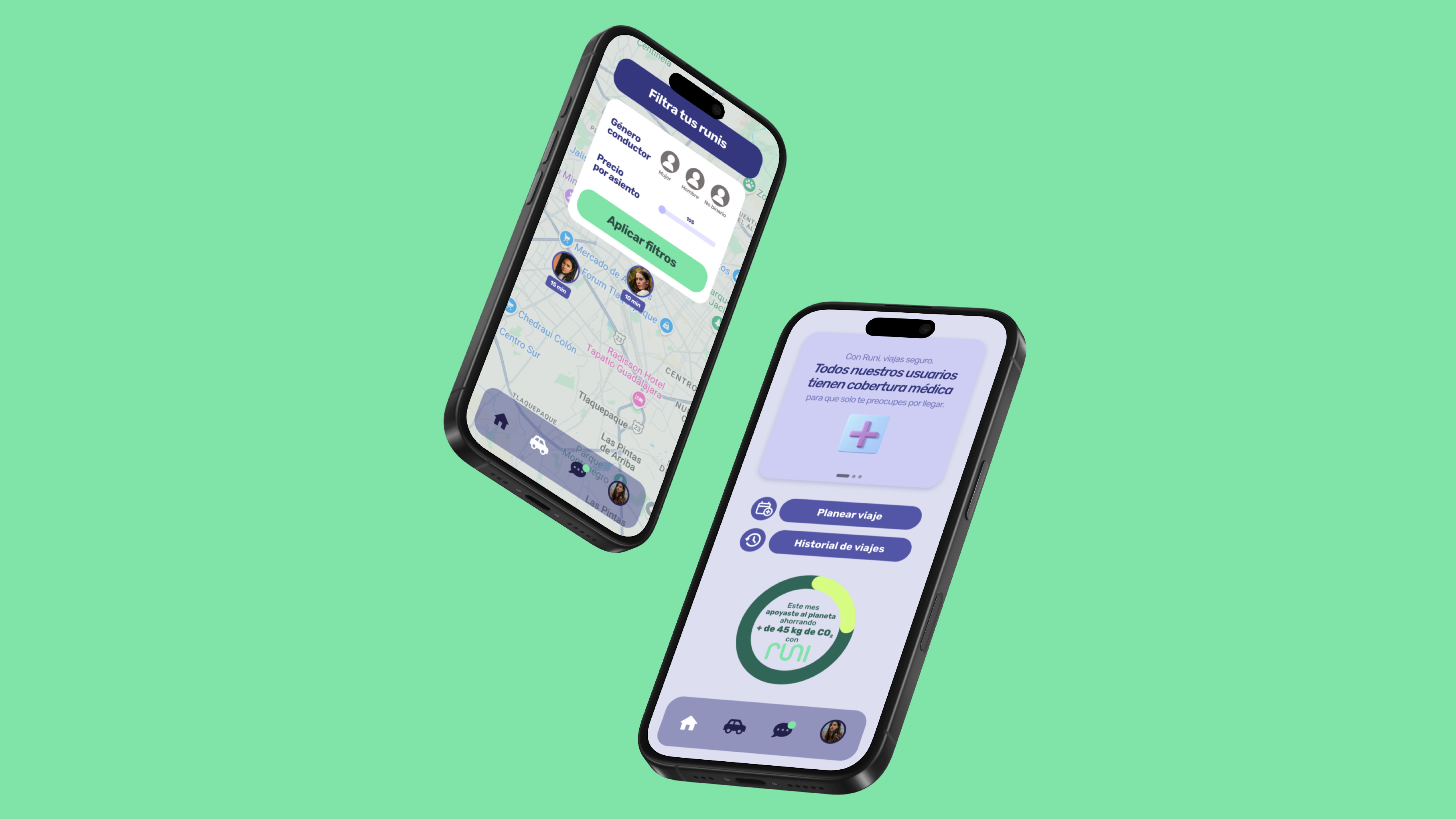
Runi Carpool App
Through an application, we will provide the university network with the opportunity to organize shared trips, satisfying the needs of the university network.
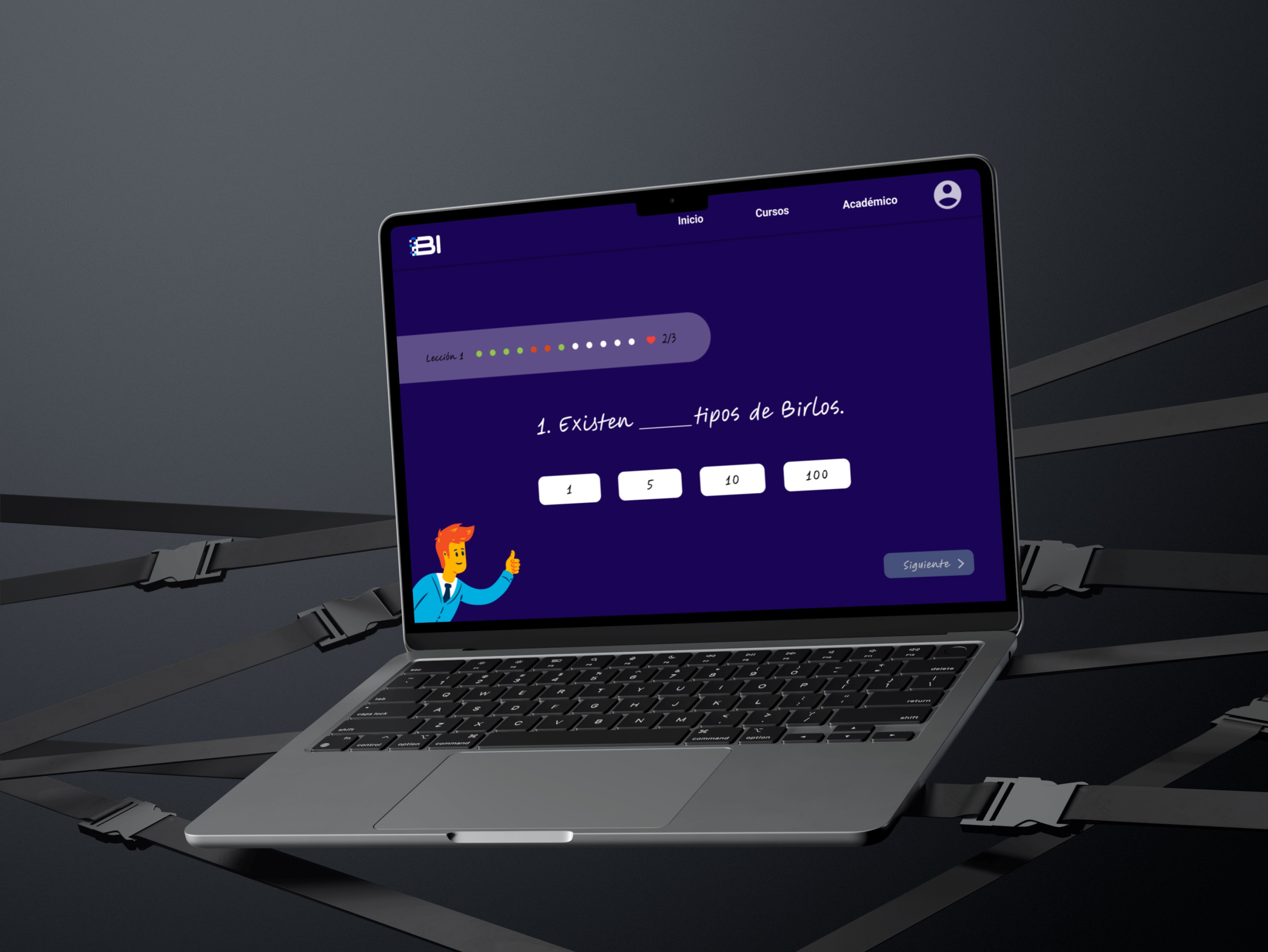
UI Design for a Financial learning platform
Designing a financial learning platform to teach business administration and management, from concept to prototype.
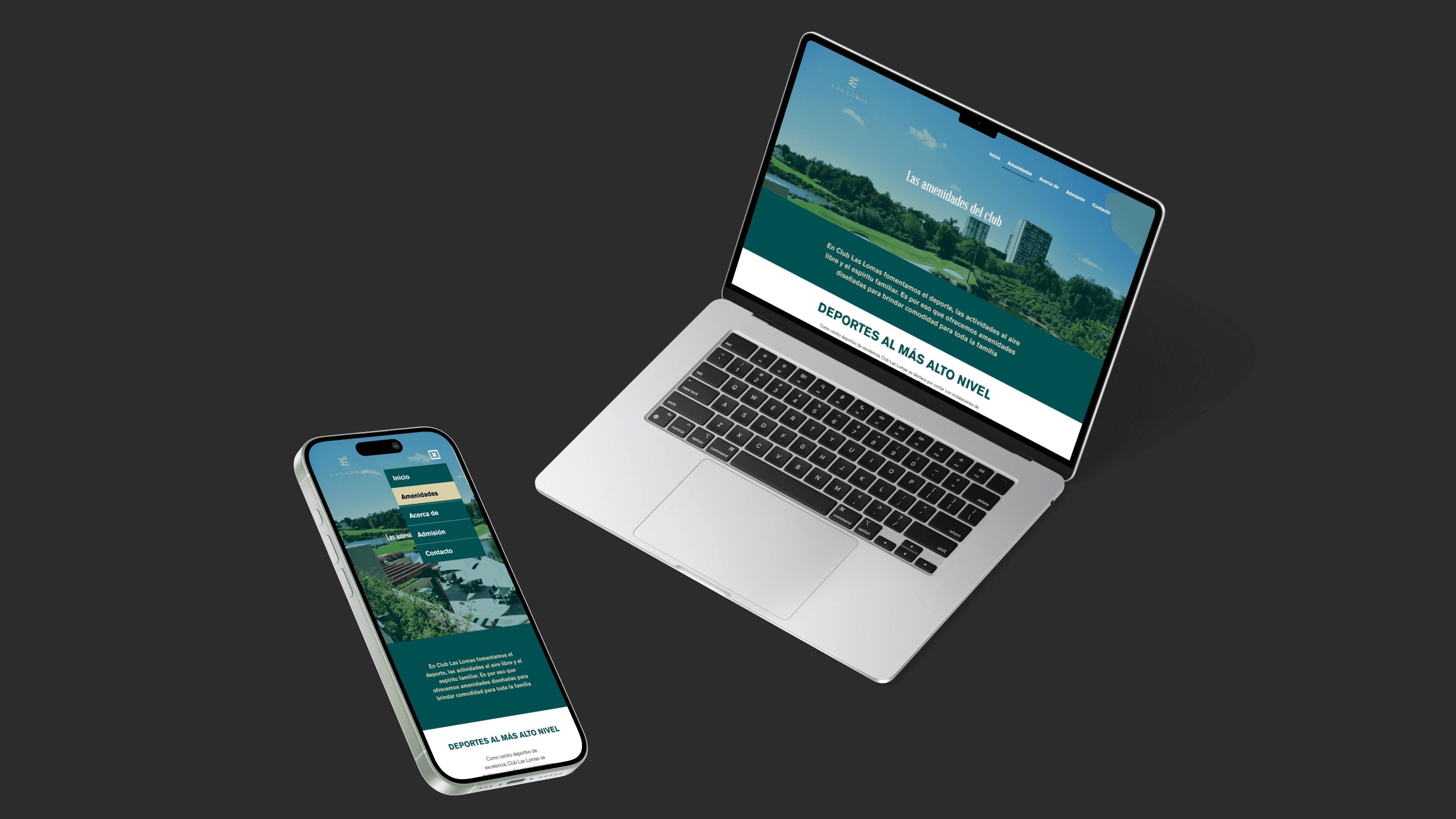
Responsive Wordpress site for a Golf Club
Designing the experience this Golf Club offers through a website aligned to their brand.